Google has a new logo. What do you think?

Google has a new logo. What do you think?

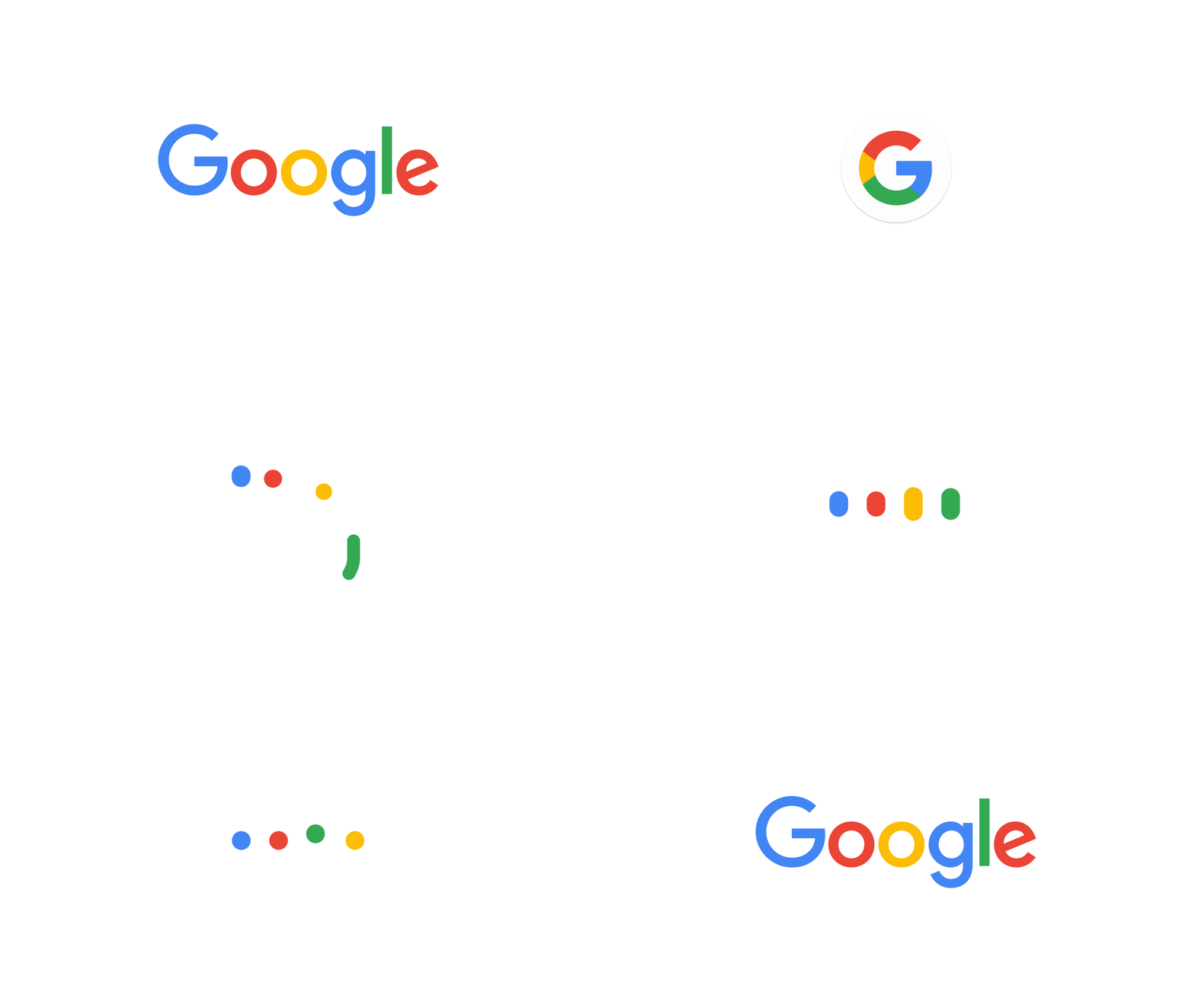
First they changed their name, now they’ve changed their logo. Google introduced a new sans-serif and slightly toned-down four-colour logo on Tuesday in the biggest redesign since 1999.

Google said the new design would soon be seen across all its products. Google’s homepage introduced the redesign with an animation that wiped away the old logo and drew the new one.

“Google has changed a lot over the past 17 years – from the range of our products to the evolution of their look and feel.

The company said the redesign was meant to reflect the way that people interact with Google products across many different platforms, apps and devices. 

“It doesn’t simply tell you that you’re using Google, but also shows you how Google is working for you. For example, new elements like a colorful Google mic help you identify and interact with Google whether you’re talking, tapping or typing. Meanwhile, we’re bidding adieu to the little blue ‘g’ icon and replacing it with a four-color ‘G’ that matches the logo.”

The logo has undergone many, mainly small, changes in its history. The colours have changed, 3D letters have been flattened, and an exclamation point came and went in 1999. 

The move comes just a month after a major restructuring of the company was unveiled. Google is now owned by Alphabet, a holding company created by founders Sergey Brin and Larry Page to separate their money-making search engine company from the loss-making, “moon shot” projects like robot cars, medical research and internet-delivering balloons.


7 Design Details Only Graphic Designers Can See

There are things that are not visible to the naked eye like tiny particles and organisms that require special apparatus to be seen. But there are also details that aren’t exactly tiny but are oftentimes overlooked because to others, they are unnecessary.

In graphic design, attention to detail is very important. To be a good graphic designer, you must start by training your senses to recognize different design details that only we designers are trained to see.

1) Wide Range of Colors

designers-see_colors

Graphic designers see beyond the 16-pc crayon set. In fact, we can identify more than 16 shades of pink crayons. Sometimes, we even memorize the hex codes of basic colors! Challenge your eyes and take the online color test where you’ll have to arrange color blocks by hue order.

2) Improper Kerning

designers see_kerning

Proper kerning is needed to give our letters equal room to breathe. To most, the first two words look the same, but when we look at the third word, we can see the different between the first two. The image above was taken from an online kerning game that lets us practice our kerning skills by moving the middle letters of words to achieve proper spacing.

3) Wrong Shadows

designers-see_shadow

Above is a sample of the proper shading with a given light source. This is commonly taken for granted because people assume that all shadows are the same but they’re not. When we analyze the light source, that’s the only time we can apply a shadow to our work properly.

4) Font Differences

designers-see_font

A real graphic designer or typographer should be able to tell one from the other. There are many font face dupes for paid fonts making it hard for us to distinguish the original and the copy. Above we can see the all-time favorite font Helvetica and its free copy, Arial. All the cuts of Helvetica are straight while the Arial’s are slanted. Notice the E and T of the second word.

5) Image Compression

designers-see_effect

Doesn’t it frustrate you when you work on a sharp image and it appears blurry after compression? Don’t let this happen to you. Always save your files in the proper format, size and resolution.

6) Jaggies

designers-see_jaggies

Nope, this isn’t similar to the definition loss during image compression. Jaggies are “stairlike lines that appear where there should be smooth straight lines or curves” according to Wikipedia. Sharpen your bit-mapped graphics and check if your display monitor has the right resolution for your graphic needs.

7) Poor Alignment

designers-see_alignment

A few centimeters to the left, a little move to the right. It’s hard to get alignment right without the right tools. Elements don’t always have to be centered, but using guides and smart guides to balance your work always helps.

Don’t forget that graphic designers are human too and we are just as likely to commit these mistakes. It’s always easier to point out what’s wrong in other people’s work. What design details can you add to this list? Let us know through our Facebook and Twitter!

Apple didn't introduce a smartwatch—it introduced an entire lineup

Apple didn't introduce a smartwatch—it introduced an entire lineup

The Apple Watch is finally here!

Perhaps there was too much build-up for the device, but despite it, the Apple Watch is impressive. It has animated emojis! It can detect your pulse! The screen is scratch-resistant digital sapphire

But truly, what sets the Apple Watch apart is its variety. It comes in two sizes (one larger, one smaller and ostensibly designed for lady wrists) and three different models: Apple Watch, Apple Watch Sport, and Apple Watch Edition, which is made of 18-karat gold. There’s also six band options, including a sport band, leather loop, and a stainless steel link bracelet that loops over itself, and you can swap between watch faces to customize your user experience.

There's truly a nearly endless amount of Apple Watches you can create, but let's do some math and try and quantify it. 

Apple Watch 

There are 10 total models of the Apple Watch Sport, which differs from the standard Apple Watch in that it looks a bit like a higher-tech version of the Baby G watch your best friend at sleepaway camp used to wear. It comes in two aluminum cases: silver, and “space grey.” The bands come in five different colors: Blue, pink, silver, white, and black.

You can get the standard Apple Watch in stainless steel or space black stainless steel casing, with six different bands: the link bracelet, the metal mesh Milanese loop, the modern buckle band (in brown, light pink, and dark blue), the classic plain black buckle, the fluoroelastomer sports band (available in white and black), and the leather loop (in stone, light brown, and bright blue.) So all told, there are 22 models available in the collection.

The Apple Watches are designed with a quick-release mechanism that allows the straps to be interchangeable, so you can slip a new strap on and off depending on your mood (or your outfit.) In this sense, the Apple Watch offers more options and is a hell of a lot more versatile than, say, Samsung’s Galaxy Gear smartwatch, which is available in six different colors, or the Pebble smartwatch, which is available in 10 different colors but, with its bulky straps and square face, looks like something Judy Jetson would wear to her prom. It is, however, more expensive: The Apple Watch will start at $349 when it’s released early 2015.

Photo via Apple

Hershey's New Logo Looks a Lot Like the Poo Emoji

Hershey's New Logo Looks a Lot Like the Poo Emoji

Hershey's new logo has hit the fans.

Introduced internally in the spring, Hershey's on Thursday introduced its latest iteration, which strips the Hershey's Kiss of its silver foil. The result, as many were quick to note, bore a striking similarity to a pile of feces:

Others tweaked the new logo to look like the poo emoji:

Hershey's reps could not be reached for comment. The design blog Brand New notes that the the visual treatment was created by Hershey Global Design, which was led by Ron Burrage, senior director global head of design, along with goDutch with a custom font from Alexander Design Associates.

The introduction of the logo is not the first design flub of the summer: Airbnb's new logo sparked comparisons to the female sexual organ in July. 

75 Years of Batman

75 Years of Batman

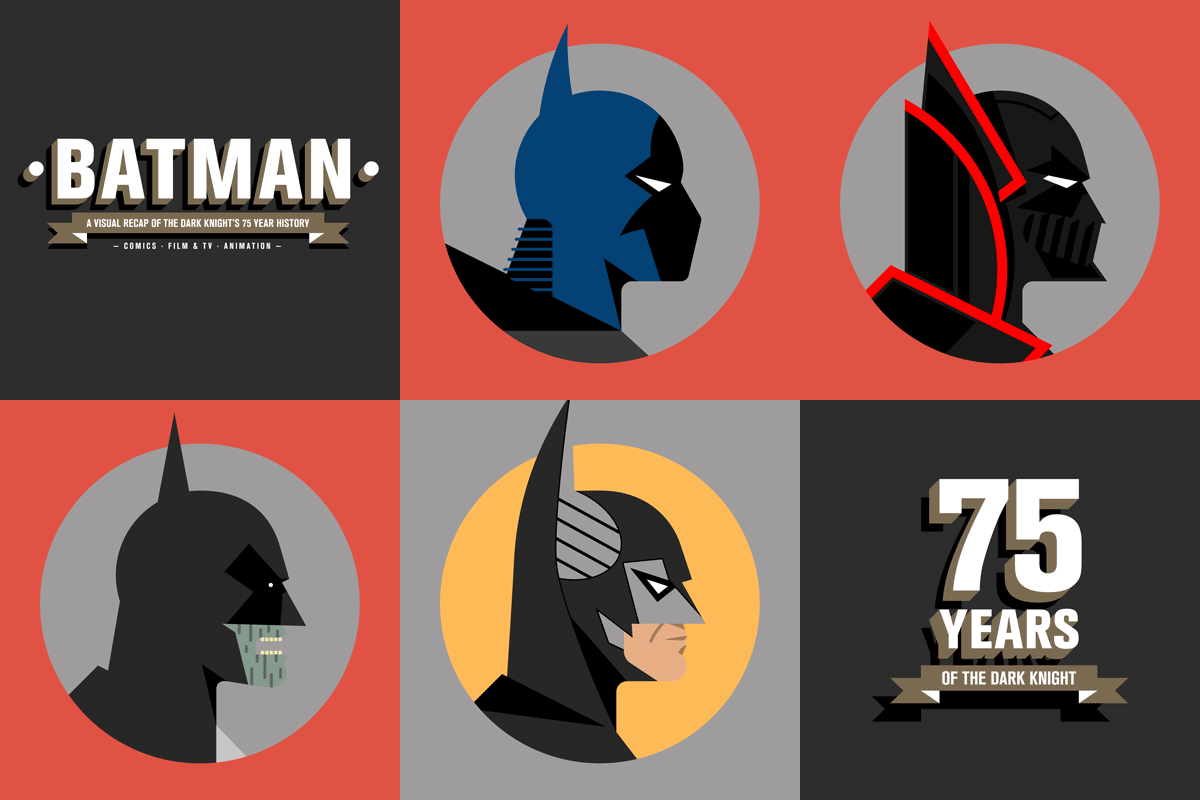
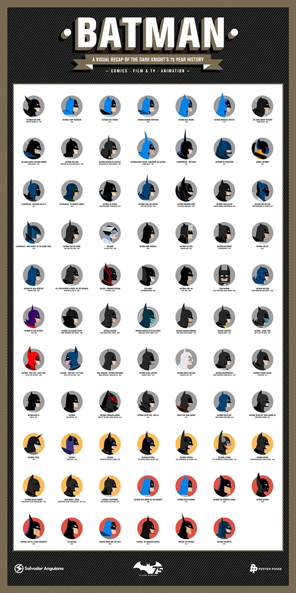
To celebrate Batman’s 75th anniversary, an artist created a poster featuring profile illustrations that represent key points in The Dark Knight’s history.

Mexico-based independent graphic designer and illustrator Salvador Anguiano exhibited a beautiful illustration style on his entry for the Poster Posse project celebrating the 75 years of Batman. Inspired by the works of Miguel Camilo, the poster showcases 75 different profiles of Batman – the distinguished cowl – each representing an important moment in the superhero’s long and ongoing career.

Salvador chose to pay tribute to as much of Batman’s looks because for him, it was difficult to pick just one era out of the character’s rich history. From Adam West to LEGO, the illustrations within the poster was done in a consistent subtle geometric style that still kept the recognizable differences of each particular Batman. The profiles are grouped into color-coded categories specifying the hero’s appearances in comics, video games, movies, television shows, and animation.

If you aren’t already following us, visit INKmake’s facebook page to keep up with the latest trend and updates on art, design, news and technology.

These ads explain why books are always better than movies

Everyone with wrinkles on their brains knows that the book is almost always better than the movie. The book can do so much more! Your personal vision is only limited by your imagination! The little details and subtleties are allowed to breath better! These ads explain it rather perfectly saying, "a big part of the story is lost when it becomes a movie".

The clever ads are for Sebo Museu do Livro in Brazil and show a book cut to the shape of a DVD. The leftover parts of the book are what's lost in translation when you just watch the movie.

Do you need a new logo?

Do you need a new logo?

Often, companies will update their logos, giving their brand a refreshing new edge and making it more relevant. Here are 7 warning signs that it may be time to update your logo:

1. It Doesn’t Work Across All Mediums

Maybe you love the logo you have now, but if it doesnt translate across ALL mediums, it isnt successful. Having a logo that translates great in both print and web is ideal. It’s also important that it is just as strong in color as it is in black & white, as sometimes you will be using it with only black ink (ex. faxes or screen-printing). It should also work well should it need to be reversed to white to show on a dark background.

2. It Doesn’t Communicate the Correct Look & Feel

You might have a strong mark, but it should communicate your brand effectively. Your logo should match your brand and be something that consumers can easily identify with. If you are a high end boutique, the logo should look high end. If you are a health and wellness spa, you should use calming colors. Thinking about how consumers will perceive your logo is important.

3. It Wasn’t Professionally Created

If you had a family member design your logo, but they are not a graphic designer, it might be time for a professional to assist you. Your sister might be great at drawing, but does she specialize in creating polished and professional logo marks? If you want your business to succeed, a professionally created logo is essential. You need to make sure you’re getting the correct file types, so that you will be ready for any sort of logo application.

4. There’s Too Much Going On

It’s not a good idea for a logo to include a lot of small details. It doesn’t have to be minimal, but some level of simplicity is usually stronger than clutter when it comes to logos. You need to make sure that your logo won’t lose any detail when it’s scaled down. Remember, it will be viewed at a range of sizes. It can be placed on very large signs, billboards, business cards or even pens. The simpler the logo, the more likely it’ll be recognized at these different sizes.

5. Easily Mistaken For Another Company

The last thing you want is for people to confuse your logo for another. You need to appear unique and one-of-a-kind, not like you’re copying someone else’s idea. When working on the design, make sure you aren’t reminded of an already existing logo. Make sure it is something that was sketched from scratch, uniquely for your business. This is why you do not want to purchase any pre-made logos online, or any $100 logos from websites with “logo contests.”

6. It Doesn’t Set You Apart From Competitors

If you are in a very niche market, most likely your competitors use some similar elements in their logos…but this doesn’t mean you have to. In fact, if you see something that your competitors have in common, avoid using it to ensure you’ll look different and stand out. Do your research and know what elements, colors and icons your competitors are already using.

7. It’s Too Cliché

Don’t jump to the first idea that comes to mind, when developing logo ideas. You want your logo to be clever and creative. If it’s too literal then it will appear uncreative and tacky. Try to think outside the box (or find a designer to do this for you) and create a logo that will evoke some type of emotional connection or instant response from your ideal consumer.

Other things to consider:

• How does the name of your company fit with any graphics used in your logo?
• Is the name of your business legible in the logo?
• Currently, are the colors what you want consumers to associate with your business with?
• Does it look too much like clip art?

If any of these signs are true about your logo it may be time for a change.

To find out more about how we can assist you with your logo:

Man Makes Paper F1 Car, Gets Job At Red Bull Racing

We all hope that we'll be able to translate our talents into paying jobs, even if they are a little unusual. Paul, the subject of this video never thought his talent--building unbelievably intricate models of Formula One cars from paper--would lead to a job with an actual F1 team.

Building a plastic model kit is one thing, but ripping apart cereal boxes and making the results look like aluminum and carbon fiber is another. Paul's model of the Red Bull RB7 has around 6,500 parts, including a fully-detailed engine, suspension, and cockpit. You'd be hard pressed to tell any of it was made from paper.

In fact, the models were so good they didn't just impress the denizens of the Internet, but also the top brass at Infiniti Red Bull Racing. Paul was offered a job in the team's engineering department, where he's worked on the 2014 RB10 car.

While Paul has traded paper and scissors for carbon fiber and modeling software, he views both as two facets of the same pursuit: designing objects in two dimensions, and making them in three dimensions.

"It's basically my hobby," Paul said of his job at Red Bull. Talk about doing what you love.

If you aren’t already following us, visit INKmake’s facebook page to keep up with the latest trend and updates on art, design, news and technology.

Mass Incarceration in the US

Thanks to Visually for facilitating the creation of this video, to kurzgesagt for the animation, and to The Prison Policy Initiative for research help and fact checking. It wasn't easy to pick this topic, but I believe that America's 40-year policy of mass incarceration is deeply unethical, not very effective, and promotes the security of the few at the expense of the many.

If you aren’t already following us, visit INKmake’s facebook page to keep up with the latest news and updates on art, design, news and technology.

Human Ooze

A unique look at population density around the world. Where are the humans oozing out from globally?

If you aren’t already following us, visit INKmake’s facebook page to keep up with the latest news and updates on art, design, news and technology.

A Century of Chairs

A Century of Chairs

A brilliantly stylised and striking infographic showing the evolution of chair design Grand Confort to Aduatz's bizzare Spoon Chair and beyond. Which is your favourite?

Why Responsive Design is Important: 10 Key Statistics

Infographic outlining numerous reasons for why responsive design is a sound choice for most web design endeavors. Takes a comparative look at responsive design versus having a mobile site (adaptive design).

If you aren’t already following us, visit INKmake’s facebook page to keep up with the latest news and updates on art, design, news and technology.